
Narrative Takes Command: Revisiting Manplan and Fotoromanzo, photo sequences in architectural magazines around 1970
Written by Carlos Machado e Moura
London, September 1969. Hubert de Cronin Hastings, director of The Architectural Review, radically changes the form and editorial content of the magazine, transforming it into a model almost exclusively composed of photography. This change gives way to eight special issues titled Manplan, composed of photographic essays that pessimistically portray the state of the nation, rethinking categories of the society and questioning the role of the architect.
Torino, 1971. Pietro DeRossi is invited by Emilio Ambasz to participate in the exhibition Italy: The New Domestic Landscape at MoMA (New York, 1972). Committed to the political turmoil that dominated Italy at that time, DeRossi and his group chose to narrate the social debates of the moment through Fotoromanzo, three issues freely distributed and sponsored by Casabella, that later published them in Italian version. These stories describe the housing problem and rethink the role of the architect.
Albeit unrelated, both cases demonstrate how, in specific contexts at the turn of the 1970s, two of the leading European architecture magazines incorporated narrative apparatus of the mass media. e visual narrative –in the forms of a photoessay or a photonovel – was chosen to carry out a critical analysis of society and to propose a new (social) function for the discipline. In this article we analyze the context of the two examples, nding clues to these radical editorial options, their meaning and potential. We argue that the surprising visual side – that results from the photography and uncommon layout –, paralleled by a narrative side – articulating image and text and exploring sequence –, as well as a performative side – in a call for action – gives each of them a hybrid nature. Manplan crossbreeds the sociological enquiry and the photojournalism of postwar England with an immersive cinematic-like experience. Fotoromanzo associates photo comics with the Marxist political pamphlet, further developing a situationist communication device. Underlining McLuhan’s motto the medium is the message [1], the experience with media isn’t limited to the editing of the publications but incorporates their discourse and content.
1. MANPLAN
Manplan – an Objective for the 1970s is The Architectural Review’s response to the controversial article “Non-Plan: An experiment in Freedom” [2], by Reyner Banham, Peter Barker, Peter Hall and Cedric Price, published a few months before [3]. It consists of eight special issues edited by Tim Rock. The first three were published consecutively between September and December 1969 and the remainder bimonthly until September 1970. Fusing photojournalism and criticism, this campaign calls for a profound social reform introducing a drastic change in the visual structure and contents of the magazine, as well as in the broader conventions of the architectural press. This risky editorial option, with emphasis on photography, was imposed by its owner Hubert de Cronin Hastings – who directed the magazine since 1928 and would retire shortly after, in 1973 – against the opinion of the other editors [4].
Regretting Britain’s loss of influence in the international context [5] and with deep frustration with the state of the nation and with post-war architecture and planning [6], Manplan proposes a re-examination of various categories of society. “Health, welfare, education, housing, communications, industry, religion” are scrutinized with a humanist perspective: an “enquiry [which] is angled at achieving whitin the resources available what our society needs most rather than what will pay best”[7]. Although focusing on society rather than on buildings, the AR intends to act within the discipline [8], making a campaign aimed at “every architect whoever and wherever he is, indeed the whole building force, not to mention planners and politicians, and happens to be one for which architectural journalism can provide a platform”[9]. A journalism which “avoids the language of political tracts. Instead it surveys in pictoral form the art of the possible” and establishes a direct continuity with Townscape’s discourse, since it “offers no magic solution, (…) represents neither novelty nor innovation, but the crystallization of the priorities the Review has been establishing over a long period of time”[10]. Finally, it tries to rediscover a social role for the architect at the end of the century: “Springs, a mission – and a determination – to swing the new potential of technology, as revealed in the moonprobes, behind the real objectives of human society. The British are bad technocrats, good humanisers. Or were once. It could be a role”[11].

MANPLAN ISSUES
“Frustration”, Sept. 1969 (Photography: Patrick Ward); “Communication”, Oct. 1969 (Ian Berry); “Industry”, Nov. 1969 (Tim Street-Porter); “Education”, Jan. 1970 (Tom Smith); “Religion”, Mar. 1970 (Peter Baistow); “Health & Welfare”, May 1970 (Ian Berry); “Local Government”, July 1970 (Peter Baistow).
The magazines take the form of visual essays, depicting people and their activities in the harsh reality of everyday life, in 35mm black-and-white images of guest photojournalists[12]. With its demonstrative ability, photography becomes the key element, ensuring the traumatic e ect and the shock power of the conveyed message[13]. However “the camera always lies”[14] and just as once the AR contributed to the general acceptance of modern architecture by altering the conventions of architectural photography, here again it overturned the norms, forcing a dystopian view of England in the late sixties[15]. The claustrophobic intensity of the images is stressed by the chosen views and the wide-angle lenses characteristic of street photography, which involve the observer in the image[16]. The specially prepared matte black ink[17] absorbs the light accentuating the dramatic aesthetics of the photographs and gives the reader a different tactile experience.

Manplan 1 - Frustration
The Architectural Review, September 1969.
Photography by Patrick Ward.
Graphic design also changes radically. Pictures spread along a full or double page, and even more as some sheets unfold in a wide format[18]. Other times, just the opposite, a small photograph occupies the centre of the page, wrapped in a large black frame. According to Paulo Catrica, this layout “aimed to emphasize the visual autonomy of each photograph within the theme, as well as strengthen its relations to the whole argument”[19]. The covers assume sinister and disturbing graphics in a punk aesthetic with beheaded and dissected heads[20], in a macabre and fetishistic crescendo: a memento mori that culminates in the fifth issue, “Religion”, which cover shows a human skull trophy of a Brazilian tribe. All these harsh, dark, grain-like 35mm images contrast with the pristine photographs of empty new buildings under the bright skies of the architecture photographers who regularly collaborated with the magazine, building AR’s visual reputation[21]. Their aim is to stir readers unaccustomed to this type of approach and pessimism in an architecture magazine.
The impact of these photographs is reinforced by the hard-hitting text and its articulation with the images. Presumably by Tim Rock or Hastings himself, it is limited to the bare minimum. A short excerpt opens each issue and a longer one closes it, pointing to “Conclusions”. Along the middle pages, only one or two lines in Rockwell’s serif typeface, sometimes over the images, crosses the pages with assertive, provocative phrases of uncompromising revolutionary conservatism. It is the text of a manifesto[22] with sense of urgency, strength, persuasion, and claiming for (re)action. More than contextualizing the photographs, the text underlines their anger and anxiety. Word and images come together conveying a visual and linguistic despair[23]. The text therefore becomes the main thread of each issue, consisting of rhythmically structured continuous sentences, which formulate a linear discourse offering a univocal sequence to the reading. In parallel, a series of explanatory notes or excerpts from the press feature in a smaller font size, without breaking the continuity of the main text.

Manplan 1 – unfolding spread
The Architectural Review, September 1969.
Photography by Patrick Ward.
Manplan 1
The Architectural Review, September 1969.
Photography by Patrick Ward.
The first issue, Frustration, is the most negative and is merely descriptive. Patrick Ward photographed a month of frustration, the stress of commuters, vandalism, unemployment and poor housing conditions. In the first pages, over images of traffic we read: “Back to work the daily journey is a crude struggle crowd for the survival of the fittest. Each morning, cars, taxis and buses pour into the city from the suburbs, from the airport, from the Midlands, from the west, from the east, from the south...“[24]. As the sequence progresses, other topics emerge, like the students’ and the workers’ protests. Curiously, buildings are only explicitly addressed in the last pages, with views and layouts that deliberately reinforce their oppressiveness and desolation: a worm’s eye view of Centre Point Tower in London, at Tottenham Court Road, or three-block residential East End with an elderly couple of Pearlies[25] in the foreground. The second issue, Communications is especially dedicated to means of transport and media and the third, Town Workshop, features Norman Foster as its guest editor. Gradually the issues incorporate pages with a more conventional layout, and schemes and blueprints of buildings, schools (fourth issue), churches (fifth), hospitals (sixth), public equipment (seventh), housing (eighth) – namely Robin Hood Gardens under construction[26] – but the continuous text and full- page photography maintains the editorial coherence.
Emblematic watermark of photojournalism applied to architectural photography, Manplan’s images are unparalleled in the history of AR but have precursors in Nigel Henderson’s street photography in Bethnal Green (1949-52), notably used by the Smithsons in the IX CIAM Urban Re-Identification Grid (1953), and some Architectural Design issues which resorted to photojournalism during the sixties. Namely Roger Mayne’s photographs in Park Hill housing estate, published in the special issue Sheffield of September 1961, or the 1968 special issues Architecture of Democracy (August) Mobility (September) and Cities and Insurrection (December). But if Manplan’s images are in tune with the photojournalism of LIFE, VU and Picture Post magazines or the picturebooks of the 1950s and 70s, their sequential editing and sharp text, which works as a voice-over as we flip through the images, offers an immersive experience which is almost cinematic. Indeed one could argue that Manplan issues resonate the then emerging graphic films[27], made of static imagery, or Grafilm as they were dubbed in period handbooks[28]. These films, as Susan Sontag points out, impose the sequence and the time of contemplation of each photograph, something that a magazine can only suggest, gaining in a visual legibility and emotional impact[29].

Manplan 1 – Pearly King and Queen by housing estate
The Architectural Review, September 1969.
Photography by Patrick Ward.
Manplan 1
The Architectural Review, October 1969.
Photography by Ian Berry.
However, Manplan also is the natural result of the AR’s editorial strategy based on photographic campaigns since the 1930s[30], in particular the Townscape movement for which the magazine had been active since the second post-war[31]. Both Townscape and its subsequent Outrage already contained the seeds of the pedagogical, optical/cinematic and mobilizing components of Manplan:
a) The pedagogical approach emerged in the very first Townscape issue “Visual Reeducation”[32], aiming to Re-Educate the Eye;
b) An optical model, in the visual way that the whole theory of Townscape was structured, according to the viewpoints of the moving person, meticulously represented in Gordon Cullen’s hand drawn sequential perspectives: the Serial Vision of the “Eye as Movie Camera”[33];
c) The mobilizing side of the campaigns which toughened over time: Outrage[34], Counter-Attack against Subtopia[35], Counter-Attack: the Next Stage in the Fight Against Subtopia[36], etc.
While the discourse became harder and more politically engaged as it approached the sixties, reaching the pessimism of the Manplan’s humanist manifesto, the importance of photography and its edition was constantly determinant. Although based, at the beginning, on small unpretentious photographs, with an eminently practical side of recording good and bad practices, their layout treatment was often close to photojournalism. As Robert Elwall accurately points out, photography in the AR has always been a collaborative process since the 1930s – of selection, organization, cropping, and articulation with the text – a work “too important to be left to photographers alone”[37]. The best synthesis of Townscape’s photographic and cinematic project, which broke out in Manplan, can be found on the first two covers, depicting human heads’ with an AICO lens Anastigmat 1:35 f = 35mm in the place of the eye: the “Eye as Movie Camera”.
Despite the great editorial innovation it represented, the experience of Manplan was commercially negative, causing protests from readers and the editorial team itself[38], being abandoned. In 1971, the editorial team was reorganized, Pevsner and J. M. Richards left, after 25 years with Hastings in the AR. Hastings, then 69 years old, still launched his swansong campaign in 1971, Civilia, composed of a series of photographic collages carefully prepared by Kenneth Browne, before leaving the magazine in 1973.
2. FOTOROMANZI
Italian-Argentine architect Emilio Ambasz invited Pietro DeRossi, architect and assistant at the Politecnico di Torino[39], to join the exhibition Italy: The New Domestic Landscape. Achievements and Problems in Italian Design at MoMA from May to September 1972[40]. Feeling that presenting his design projects[41] would contradict his political engagement, DeRossi decided to take the main social and disciplinary debates of the time, namely housing, to New York[42] by means of a popular lowbrow medium in Italy, fotoromanzo – photo comics or photonovel. To do so, he gathered in 1971 a group of other assistants of Carlo Mollino[43] at the Politecnico – himself, Giorgio Ceretti, Carlo Giammarco, Riccardo Rosso and, a bit later, Maurizio Vogliazzo[44] – to form Gruppo Strum, short for Architettura Strumentale.
Before choosing this medium, Strum developed a project of an installation for the exhibition just like the other participant radical groups[45]. Superstudio, Archizoom, 9999, Ugo La Pietra, and others, all sought to approach design as a form of criticism of the cycles of mass production and object consumption, considering it in a symbolic and political dimension in need of a radical change[46]. Strum’s proposal consisted of a series of spaces equipped with communication devices that would record and play information through video – by means of cameras and projection screens – but also typewriters or posters. However, this project was abandoned due to economic and practical reasons, since the technology they intended to use was not yet available[47]. Ironically, they opted to explore the photonovel, an extremely popular mass medium built through composite photographic imagery[48], seeking to enter the debate on technology and communication[49]. But this choice cannot be read apart of the wider context of the politically subversive exploration of collage with comic strips and photonovels through the techniques of ‘détournement’ used by the situationists since the 1950s[50]. These rapidly disseminated in the alternative press and were explored by other avant-garde architects[51]. Alessandro Mendini, then director of Casabella, associates Strum’s Fotoromanzi to the mix of different types of media that proliferated in underground magazines such as Re Nudo[52]. Curiously enough, some years later the critic Pierre Restany had a regular section in Domus made of photonovel strips[53].
The Italian political and social context was tense as the country rapidly shifted from decades of economic miracle to a period of crisis. Turin, a heavily industrialized city, home of FIAT headquarters, became the epicentre of the political struggles of the sixties. Mass emigration, the housing problem, and workers’ and students’ contestation were the order of the day[54]. This explains why, although the entire Italian radical movement has a strong political basis, the specific activity of the Turin group is by far the more politically engaged. Some members of Strum were particularly politicized, like Marco Giammarco, while others balanced their political commitment with an artistic interest. In fact, Turin was also an important centre of contemporary art[55] and the architects of Strum were related to several artists with whom they contacted regularly[56]. Turin offered a fertile cultural milieu, in which art and architecture were intertwined, facilitating exchanges and experiences. And this artistic side thus weighed on the choice of the photonovel. Fotoromanzi were handmade, borrowing from different media, from photography to press clipping. Once the script was defined, art photographer Paolo Mussat Sartor[57] took pictures of the characters – three actors among the members of the group – and locations chosen according to the narrative. These images were then subjected to a meticulous work of manual correction, with superimposition of other photographs and media through collage. is set of images was sequentially organized, following what Barthes called a process of syntax connotation[58].

Architecture Review campaigns
Townscape (AR n. 636, December 1949), Outrage (AR n. 702, June 1955), Manplan (AR n. 872, October 1969)
Italy: The New Domestic Landscape exhibition at MoMA
Cover of the catalogue (left); Strum’s first project for an installation (right)

The Struggle for Housing/La Lotta per la Casa; Utopia; The Mediatory City/La Città Intermedia.
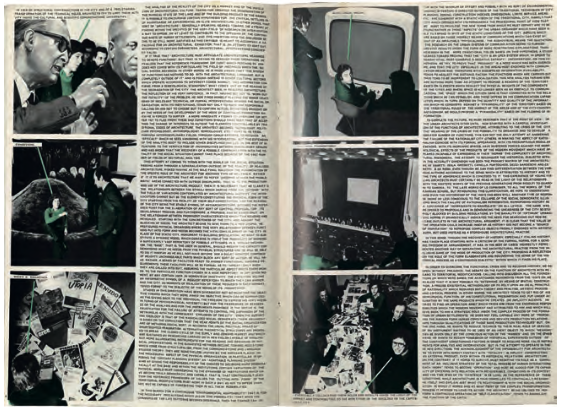
Fotoromanzo issues Fotoromanzo — The Struggle for Housing
Three stories – “The Struggle for Housing”, “Utopia” and “The Mediatory City” – were printed in thousands of copies[59] and freely distributed during the exhibition with the support of Gufram and Casabella that fully financed the operation as a form of marketing – each issue featured a subscription form to Casabella. Italian versions of the three Fotoromanzi were subsequently published in the magazine’s August/September double issue[60]. These fictional stories involved stereotyped characters: the capitalist, the worker, the student, the activist and the architect. “The Struggle for Housing”, the most descriptive, tells the story of immigrants just arrived in Turin who are unable to find a house and wander through the city in search for solutions. “Utopia” presents imagery of alternative cities and societies, including schemes and projects by other radical groups. “The Mediatory City” is the most propositive issue and seeks to formulate a pragmatic and operative approach for architecture as a means of participation in social struggles. It reflects on a possible mediation between utopia and the needs for an urgent response to social demands. The proposal lies in using existing urban spaces and recovering low-cost structures such as stalls and containers for temporary housing, social services and even communication (anticipating a type of communication made possible only much later). Vogliazzo defines this point of view as a social-democratic process – managing to bring people’s rights, conflicts, and social and cultural development through information – a dynamic process without a determined form that can be constantly reviewed[61]. DeRossi later explored this topic under the name “narrative city”[62] with philosopher Gianni Vattimo.

Fotoromanzo
Utopia
The texts of the Fotoromanzi were entirely written by Carlo Giammarco, who did not entirely share the rest of the group’s interest in the artistic and visual values of the piece. Very long, dense, and highly ideological texts were much in tune with the political tracts of the period. But their size and eagerness to be as detailed as possible, makes them suffocating and entirely mismatched with the medium in terms of communication. Also, the English translation, in a somehow old- fashioned manner, further complicates the already dense Italian original[63]. One can easily imagine how hard the English-speaking public might have found these documents. To make things worse, the type is entirely upper case in a non-serif font Helvetica with a very tight leading, making it difficult to read. This deliberately typographic choice made by some members[64] aimed to drive the Fotoromanzi to its autonomous artistic dimension, a provocative operation towards the serious political and social questions they addressed.
The reception of Fotoromanzi was varied. Umberto Eco enthusiastically referred their “coherent intelligence” in a special issue of L’Espresso[65], by their communication ability, artistic materialization and ideological tone. It is however curious that later recounts of the members of the group tend to stress the political commitment, leaving the artistic component behind.
Yet nowadays these Fotoromanzi became fully integrated in the art market, collector’s pieces sold at high price. The compromise between the performativity of the visual medium and the incomprehensibility of the text gave them perhaps a new life, the one of a work of art.
3. Coda
Manplan is a ground-breaking and controversial example of architecture (photo)journalism and Fotoromanzo are a provocative artistic experiment. Both are striking testimonies of narrative applied to sequential photography in major European architecture magazines around 1970. In a time where the architectural press was exploring different types of media, they balance their communicative ability with a daring performativity and a mobilizing visual discourse. They now might live a new life as works of art, seducing the viewer no longer by their charged messages but especially by their distinctive graphics and the photographs’ grainy and silvery tone. However, it is remarkable that not only they explored different emergent apparatus of mass media but also felt the need of putting communication at the core of the content. Strum’s “The Mediatory City” exploring the social power of audiovisual devices and Manplan’s second issue “Communication”, speculating on the pocket communication devices, both aimed for a technological utopia: a renewal of human relationships through the introduction of new media. More than anything else, maybe this is truly avant-garde.
Fotoromanzo — Utopia

Fotoromanzo — The Mediatory City
_______________________________
[1] M. McLuhan, Understanding Media: The Extensions of Man, McGraw-Hill, 1964.
2 R. Banham, P. Barker, P. Hall, C. Price, “Non-Plan: An Experiment in Freedom”, in: New Society, 20 March 1969, pp. 435-443
3 Non Plan proposed “a precise and carefully observed experiment in non planning”, the abolition of planning rules in certain areas as a way of offering citizens a greater freedom of choice. They sustain the failure of the over-regulated British development, which created a less dynamic, interesting and habitable environment than the virtually unregulated sprawl of the American city. These ideas had a large influence on British cities, opening the way, for example, to the London Docklands under the Thatcher government. Although there is no direct mention in Manplan, the title contrasts with a different form of planning, placing man in the centre. While also criticizing British planning of the 1950s and 1960s, Manplan ideologically opposes Non-Plan, taking a critical stance on consumer society and uncontrolled economic growth.
4 In particular that of James Maud Richards who, in his Memoirs of an Unjust Fella, recalls the unenthusiastic support of the other members of the editorial team who, in addition to the novelty effect, saw few advantages in this change. Richards objected to the sacrifice of the AR structure – in particular to the role of text and the publication and criticism of buildings – and remained editor only in the alternate non-Manplan issues. See “Cloudy with bright periods” in: J. M. Richards, Memoirs of an Unjust Fella, Weidenfeld and Nicolson, 1980.
5 The introduction text (AR, August 1969, p. 90) begins precisely with the loss of the role of Britain as a world power. British economic recovery in the 1950s was slow, and the growing influence of the United States of America in British culture disturbed many intellectuals. Others, like Reyner Banham, then young assistant editor of AR, embraced American culture.
6 In particular the British New Towns strategy and the mass social housing schemes.
7 The Architectural Review, August 1969, p. 90.
8 “Reviewing the state of the nation in those areas where it has a patent to speak – architecture and planning.” (AR, September 1969, p. 173).
9 The Architectural Review, August 1969, pp. 89-90.
10 The Architectural Review, August 1969, p. 90.
11 idem.
12 Among them are Patrick Ward (Frustration), Peter Baistow (Religion and Local Government), Ian Berry (Communications and Health and welfare), Tom Smith (Education), Tony Ray Jones (Housing) and Tim Street-Porter (Industry), photographers who regularly published in the Sunday papers’ supplements, with the exception of Ray-Jones who often refused to work for the media industry.
J. Donat, “The camera always lies”, RIBA Journal, Vol.75, February 1968, p. 71.
13 Roland Barthes affirms that “...en photographie, le trauma est entièrement tributaire de la certitude que la scène a réellement eu lieu”, R. Barthes, “Le message photographique”,
in: Communications, 1, 1961, p. 137; while Susan Sontag refers “Photographs furnish evidence. Something we hear about, but doubt, seems proven when we’re shown a photograph of it”.
S. Sontag, On Photography, (1st ed. 1973), Picador USA, 1977, p. 5.
14 “The camera always lies” is the title of a conference by photographer John Donat at RIBA in 1968. Contrary to our use, Donat claimed for a less abstract, more realistic architecture photography, criticizing the aesthetic choice of renditions of just finished building rather than images witnessing their use. Donat, “The camera always lies”, op.cit., pp. 62-71.
15 R. Elwall, “Pepys Estate, Deptford”, The London Column, May 19th 2011, https://thelondoncolumn.com/tag/manplan/, visited: 2016.09.01.
16 idem.
17 idem.
18 Some photographs span three pages, roughly 2.2:1, a similar proportion to the panoramic formats of the 1950s and 1960s such as Cinemascope.
19 Catrica P., “The Architectural Press photographs at the core of the modern architecture paradigms, UK 1950/1970”, in: Vincenzo Riso (ed.), Modern Building Reuse: Documentation, Maintenance, Recovery and Renewal, Universidade do Minho Escola de Arquitectura, Guimarães, 2014, p. 53.
20 Similarly, AR’s April 1968 cover artist Gerald Nason produced a series of whimsy and slightly sinister drawings depicting cut-away heads, each with a unique idea of what goes on inside.
21 Ian Nairn argues that AR’s distinctive character mainly emerges from the visual experience of its pages, due to the use of photography and half-tone print. I. Nairn, Outrage, Architectural Press, 1955, p. 366. See also Robert Elwall’s comment, footnote 15.
22 Late and unsuited for Ulrich Conrad’s Programs and Manifestos on 20th Century Architecture (1971), Manplan would certainly deserve to take place in Charles Jenks’ Theories and Manifestos of Contemporary Architecture (1975), a compilation which, besides, included Non-Plan.
23 Roland Barthes sees press photography as a message and text – title, caption or comment – as a code. In the illustrated press, the text is a parasitic element that connotes the image, giving it other meanings. If in traditional forms of illustration, the image occasionally denotes the text, by providing an example, in the illustrated press it is the word that sublimates or rationalizes the image. And the image will, in turn, load the text, in a process of mutual amplification. R. Barthes, “Le message photographique”, op.cit., pp. 127, 134. Manplan seems, in our view, a good example of this dialectic.
24 The Architectural Review, September 1969, pp. 171-172, 176.
25 Pearly Kings and Queens are an organised charitable tradition of working class culture in London.
26 The Architectural Review, September 1969, p. 169.
27 Following the Eames’ films in the 1950s, made exclusively with static photographs, this form of cinema was generalized in the sixties culture as a form of low-budget montage,
integrating photographic stills with pre-existing images. The films of Chris Marker, La Jetée (1963) and Si j’avais quatre dromadaires (1966) are paradigmatic examples.
28 J. Bryne-Daniel, Grafilm: An Approach to a New Medium, London, Studio Vista, 1970.
29 S. Sontag, On Photography, op.cit., p. 5.
30 Hubert de Cronin assumes the editorial control of the AR in January 1928. He is both a feverous advocate of modern architecture and a critical voice regarding the preservation of urban centres and the territory. To this end, he implements an editorial strategy supported by nationwide photo campaigns (by artist John Piper and J. M. Richards, assistant director since 1935) to capture the qualities of the traditional city and careless interventions or neglected heritage.
31 The theory of Townscape is the great movement carried out by the AR between 1949 and 1971. The editorial team was composed by Hubert de Cronin Hastings (editor and owner), Nikolaus Pevsner and James Maud Richards.
32 The Architectural Review, 636, December 1949.
33 G. Cullen, “Casebook: Serial Vision”, in: Townscape, London, The Architectural Press, 1961.
34 The Architectural Review, 702, June 1955.
35 The Architectural Review, 719, Dec. 1956.
36 The Architectural Review, 725, June 1957.
37 Robert Elwall, in Photography Takes Command: The camera and British architecture, 1890-1939, RIBA Heinz Gallery, 1994, p. 77.
38 Although not subscribers as Steve Parnell revealed. S. Parnell, Architectural design, 1954-1972. PhD thesis, University of Sheffield, 2012.
39 Pietro DeRossi had already been at the centre of international architectural debate as organizer of the “Utopia e/o Rivoluzione” seminar at the Turin Polytechnic in 1969, which brought together European radical architects who opted for utopia – such as Paolo Soleri or the Archigram – and those who militants for the revolution – as the Utopie group or the Archizoom.
40 The exhibition at the Museum of Modern Art in New York (26th May to 11th September 1972) was the first major initiative dedicated to Italian design and aimed to bring together the recognised masters and the new generation, which was aiming towards new avant-garde experiments, seeing design not only as the production of objects but also as a critic of society.
Large space is dedicated to radical architecture – Gaetano Pesce, Ugo La Pietra, Superstudio, Archizoom or 9999 – featuring numerous of provocative installations.
41 DeRossi had a professional activity, by family tradition, having designed some important discos, like Piper in Turin and Altro Mondo in Rimini, as well as several pieces of furniture made for the company Gufram.
42 Pietro DeRossi interviewed by Fondazione per l’architettura, at Festival Architettura in Città 2012, Turin. https://www. youtube.com/watch?v=DqjIeOqM2zs viewed: 2016.09.01.
43 Famous Italian architect, professor and photographer.
44 After the exhibition at MoMA, they attended an event in Kassel together and separated.
45 Not included in the exhibition catalogue, Strum’s proposal was published in: Architectural Design, July 1927, vol. XLIII, p. 398.
46 This dimension is evident in the curatorial division, in which Ambasz identifies conformist, reformist and provocative approaches.
See catalogue and interview: http://www.arte.rai.it/articoli/1972-italy-the-new-domestic-landscape-al- moma-di-new-york/14621/default.aspx viewed: 2016.09.01.
47 Portable video reel to reel cameras recorded on tape and were extremely costly. Furthermore no network would directly display the image on the screen, making the operation complicated and devoid of its original sense. Maurizio Vogliazzo interviewed by the author, 2016.09.02.
48 Usually dedicated to sentimental or adventure stories and built with simple photographs, mostly black and white. Its diffusion was exponential in second post-war Italy, until the appearance of television in the early 1970s. By 1958, weekly magazines, comics, photonovels and similar sold around 14 million copies, three and a half more than newspapers. Grand Hotel (a photonovel) alone sold over one million. Crapis, Giandomenico. “(Foto)romanzo Popolare.”, in: L’Unità, del 27 ottobre 2003, p. 23.
49 Also recovering a series of anglo-saxon influences, from Archigram to Ant Farm, Radical Software magazine and McLuhan’s media theories.
Maurizio Vogliazzo interviewed by the author, 2016.09.02.
50 For an overview, see: A. Sausverd, “Trop feignants pour faire des dessins? Le détournement de bande dessinée par les Situationnistes”. L’Éprouvette, no 3, L’Association, 2007, pp. 128-179.
51 Particularly French group Utopie, but also the work of Italian groups, like Superstudio’s storyboards or Ugo La Pietra’s situationist-like comic strips.
52 Alessandro Mendini interviewed by Olympia Kazi, in: B. Colomina, C. Buckley, op.cit., p. 389-391.
53 “Restanystory”, Domus n. 602 (January 1980) to n. 623 (December 1981).
54 The Faculty of Architecture of the Polytechnic of Turin, where the Strum taught, was the scene of a student revolt in 1966 against the academic teaching of some teachers and young assistants.
The students occupied and imposed a model of multidisciplinary seminars. P. DeRossi interviewed by Olympia Kazi, in: B. Colomina, C. Buckley, op.cit., pp. 320-321.
55 Arte Povera and Conceptual Art are the climax of Italian Contemporary Art and had its epicentre in Turin. Much of the artistic milieu gathered around Gian Enzo Sperone gallery, founded in Turin (1963) moved to Rome (1972) and later to New York (1975).
56 DeRossi was very involved in Turin’s art dynamics, like Ceretti, Rosso and Vogliazzo. Maurizio Vogliazzo interviewed by the author, 2016.09.02.
57 Mussat Sartor began his career as a photolithograph in 1964 and self-taught photographer. Collaborated with polyurethane furniture company Gufram, where he met DeRossi, Ceretti and Rosso. Collaborated with the Enzo Sperone gallery since 1968, becoming a famous photographer. R. Del Grande, L’immagine dell’arte a Milano negli anni Sessanta. L’archivio del fotografo d’arte Enrico Cattaneo tra il 1960 e il 1970, Tesi di Dottorato in Storia dell’Arte, Università degli Studi di Udine, 2013/2014, p. 143.
58 As in illustrated magazines, there is a work of syntax connotation in the constitution of a sequence. In this case, the sequence does not resort to repetition to suggest motion, nor is there an organization by visual proximity, but rather a sequence of images threaded into a discourse. R. Barthes, “Le message photographique”, op.cit., p. 133.
59 MoMA’s requests to Casabella for Fotoromanzi succeeded, and the first supply run out in ten days. There were several reprints of three thousand copies each, totalling hundreds of thousands.
60 La Lotta per la Casa, Utopia, La Città Intermedia. Casabella, no. 368/369, August/September 1972.
61 Maurizio Vogliazzo interviewed by the author, 2016.09.02.
62 P. DeRossi, Per un’architettura narrativa, Skira, Milano, 2000; G. Vattimo, I. de Solà Morales, P. DeRossi: Modernism without Avant-garde, Quaderni di Lotus, Electa, 1990; P. DeRossi, “Un’architettura per raccontare” in Ottagono, 94, Ed. CO.P.IN.A., Milan, 1992.
63 Made by a British classical literature professor, the translation followed the intricate and highly inflected language of the Italian version.
64 Rosso, Vogliazzo and others intentionally made it difficult to read the political texts, stressing the object’s artistic dimension. Vogliazzo interviewed by the author 2016.09.02.
65 Umberto Eco quoted from memory in M. Vogliazzo, “Thirty Years Later”, in: J–A Jornal Arquitectos, no 205, Lisboa, Ordem dos Arquitectos, Março/Abril 2002, p. 49.